FOOD BYTES IS A (ALMOST) MONTHLY BLOG POST OF “NIBBLES” ON ALL THINGS CLIMATE, FOOD, NUTRITION SCIENCE, POLICY, AND CULTURE.
As I write this, snow is floating across New York City, deeply settling me into a wintry, sedate state. Lately I have been dreaming about feeling the sun on my skin, eating juicy peaches, and wearing flip-flops…I do this every year. I yearn for crisp, cold days during the dog days of summer, but then, the blue winters come along, I long for heat, long days, and not having to spend 20 minutes layering clothes just to get out the door. That said, nothing beats homemade, hearty soups that my better half cooks up that last for several meals and doubling down on double-feature movies in the evenings. Speaking of food, let’s get to what the food world has been up to this past month – there is a lot to cover.
Scientific papers
This paper, “Health-Environment Efficiency of Diets Shows Nonlinear Trends over 1990-2011” by Pan He is getting lots of traction. They developed an indicator and applied it, as Kate Schneider (lead author of the Food Systems Countdown paper) wrote, “that builds on long-observed correlates of increasing levels of development, that is, the co-occurrence of ‘bads’ (for example, rising greenhouse gas (GHG) emissions from greater animal-source food consumption, rising risk of diet-related non-communicable disease) and the ‘goods’ (for example, the decline in child and maternal malnutrition, increased incomes and more education). With this health–environment efficiency metric, the authors sought to understand how efficiently food systems use environmental inputs to generate health outcomes.”
They show that as countries economically grow and “develop,” they tend to see improvements in health and nutrition outcomes (reductions in undernutrition). With continued development, they see animal-source food consumption increase, with concomitant environmental degradation. This is not surprising, but it is interesting to see this indicator used to prove further the nutrition transition and how critical it is to consider planetary health with human health through our food systems. The figure to the right shows the change in dietary efficiency along with socio-economic development.
Rachel Gilbert and colleagues (including my buddy, the great Will Masters) published a fantastic paper in World Development that looked at food imports and their retail prices across 144 countries. They found that lots of food is traded worldwide, and almost half face tariffs (at a rate of 6.7%). Which foods had the highest tariffs? Vegetables, fruits, and animal-sourced foods. Where? Low- and middle-income countries, but they only account for a small portion of the cost of the diet per day. Most of the food prices consumers pay are domestic value add-ons once the foods have arrived in the country. I think I got that right…
Although this paper came out in 2023, it is an important one by Matias Heino and colleagues. The paper shows the impacts of combined hot and dry extremes as well as cold and wet extremes on major crop commodity yields (of course…)— maize, rice, soybean, and wheat—between 1980 and 2009. They show that co-occurring extremely hot and dry events have globally consistent negative effects on the yields of all inspected crop types. Extremely cold and wet conditions reduce crop yields globally, too, although to a lesser extent, and the impacts are more uncertain and inconsistent. Check out the figure to the left.
Biodiversity is in free fall, which can impact both nature scapes and people. We know that agriculture and urbanization are two of the main drivers of biodiversity loss. This paper by Awaz Mohamed et al examined how much natural habitat is needed to ensure humans have access to the benefits of biodiversity, such as diverse food production (soil, pollination, etc.), high water quality, homeostatic climate regulation, and improved green spaces. They find that benefits significantly decline when habitat area falls below 20%–25% per km2, and 2/3 of agricultural and urban areas fall below this level globally.
Reports
The Food Systems Economic Commission finally came out. It was a long time coming. The report assessed one specific science-based transformation pathway for food systems, which could benefit both people and the planet. This pathway is called the Food System Transformation (FST). Estimates of those benefits, measured as reductions in the unaccounted costs of food systems, amount to at least 5 trillion USD per year. When the full effects of a global food system transformation on incomes are factored in, estimates of its benefits rise to 10 trillion USD annually. See the figure to the right that shows this power of transformation.
Podcasts
I listened to two really good podcasts this past week. The first is hosted by Ambrook Research (I highly recommend receiving their weekly newsletter). It is called The Only Thing That Lasts, and in the first episode, they delve into the potential loss of U.S. farmland (spurred by the fear that Bill Gates seems to be buying it all up).
The other podcast is Barbecue Earth, a six-part podcast about meat as a commodity, the powerful industry behind meat, and a major reason our planet is overheating. The Carnegie Endowment for International Peace hosts it. The first focused on hogs…It will make you think twice about putting bacon on your egg cheese sandwich.
Media, Social and Otherwise
Eater has made life easier for you by guiding you where you should eat in 2024. Interestingly, neither New York nor London is mentioned. Good for them. But have no fear New Yorkers, this guy has been flaneuring around Gotham attempting to eat a meal representing every country in the world. He is almost there…
This will get some agronomists riled up. Here is a webinar hosted by the Rodale Institute (which has a certain world view of food systems) on the differences between organic versus conventional agriculture systems – and how these “stack up” from agronomics, carbon footprint, and economic perspectives. Guess what the conclusion is? :)
TV and movies
We have been watching season 4 of True Detective with Jody Foster and the awesome Kali Reis. It is filmed in a fictional town, Ennis, Alaska (although filmed in Iceland). It is assumed that we are in the far northern reaches of Alaska, where the community experiences complete darkness. It is inspired by North Slope Borough, a town on the northernmost point of Alaska, approximately 50% of which comprises indigenous populations. In the show, the water is contaminated (likely from mining operations), but of course, I always notice the diets. There are lots of highly processed, packaged foods, which makes some sense because of the remoteness. In real life, in many of these indigenous communities, their traditional diets are healthy but are disappearing. Much work has been done to understand how diets have changed in the northern territories of Canada and Siberia. In Northern Alaska, among the Inupiat, the Yup’ik, and other traditional communities, many elderly are trying to preserve their traditional diets. Still, conserving these dietary patterns is getting harder and harder for various reasons.
Art Meets Food
Curious to know the most iconic food paintings? Check this out. The Normal Rockwell one is just downright creepy, but I always have time and space for Edward Hopper (who lived down the road from one of Columbia University’s campuses in Nyack, New York).
The Clash has a song, “Lost in the Supermarket.” It’s a great song, and I think many of us can relate when entering these goliath spaces meant to nourish us. As Joe Strummer sang,
I'm all lost in the supermarket
I can no longer shop happily
I came in here for a special offer
A guaranteed personality
Last thoughts
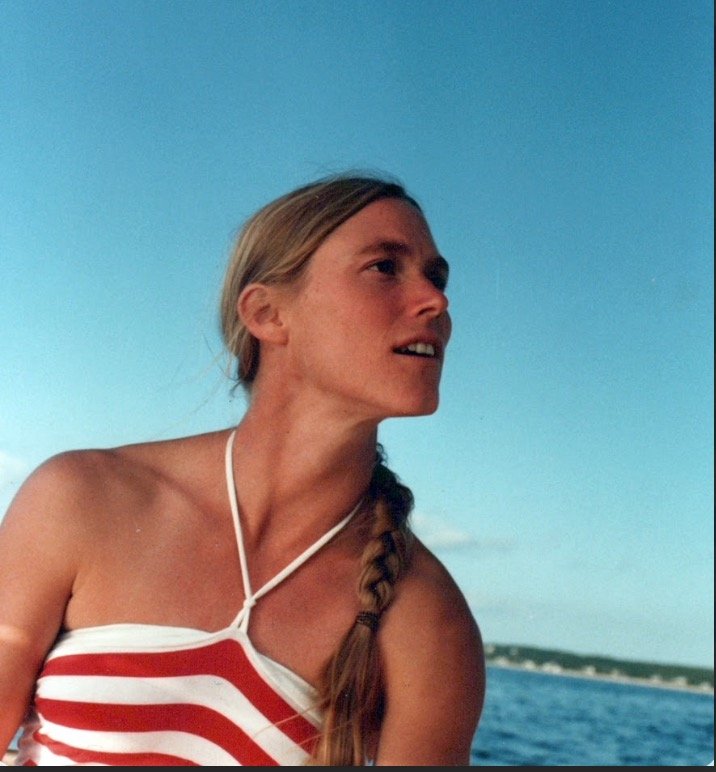
Our good friend Cheryl Palm passed away this past month from a rare and devastating disease, Creutzfeldt-Jakob disease. She was a giant in the world of food systems and made massive contributions to land-use change, degradation and rehabilitation, and ecosystem processes. Here is a lovely tribute from our Earth Institute friends at Columbia University. I love this photo of her in her younger years, full of life. That is how I choose to remember her.